MONDAY JUNE 15, 2026
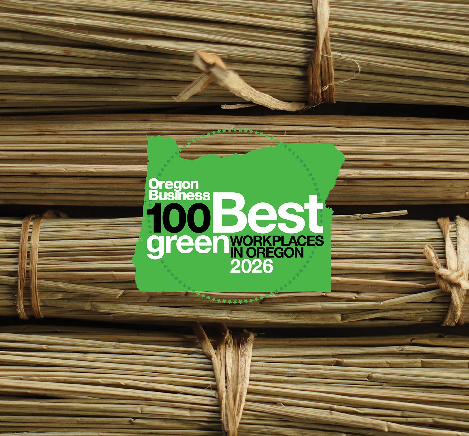
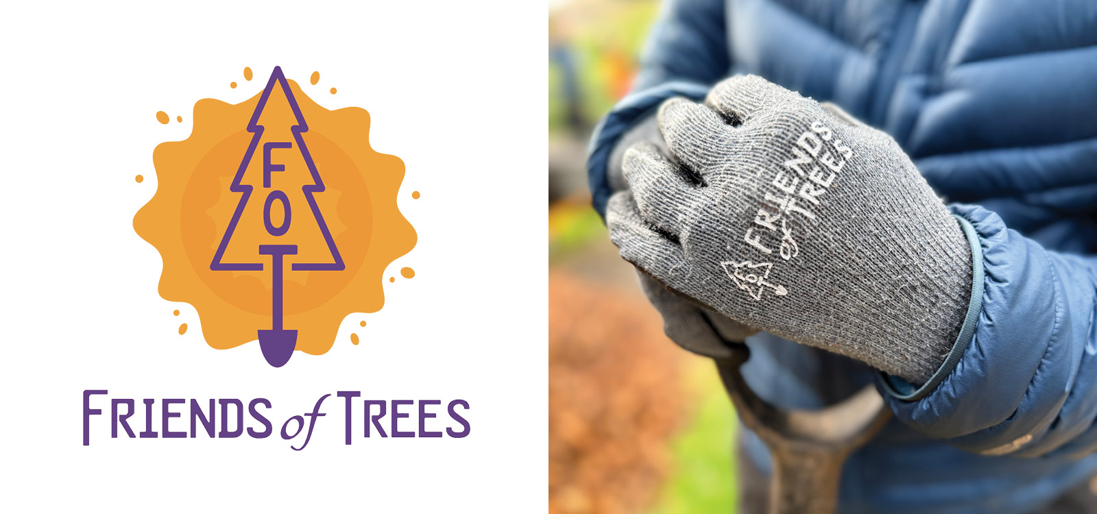
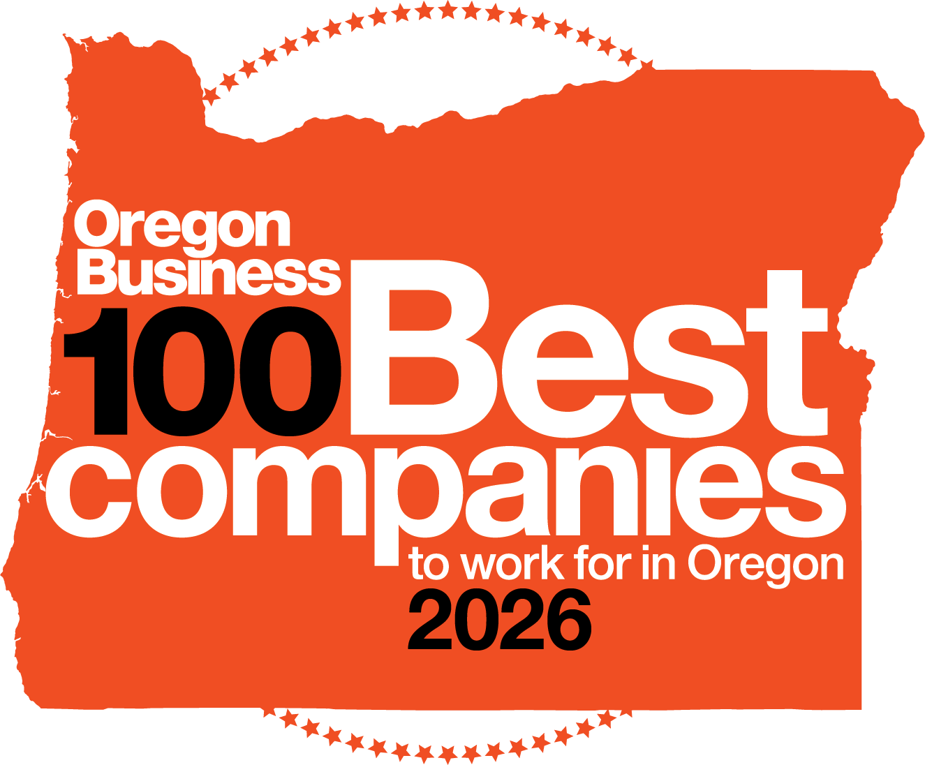
For the 14th consecutive year, Hartmann&Forbes has been recognized by Oregon Business Magazine as one of the 100 Best Green Workplaces in Oregon, earning the No. 4 ranking for 2026.
While we are honored by this recognition, we view it as something greater than an annual achievement. It reflects a longstanding commitment to stewardship, one that has shaped our company since the beginning and continues to guide the decisions we make every day.
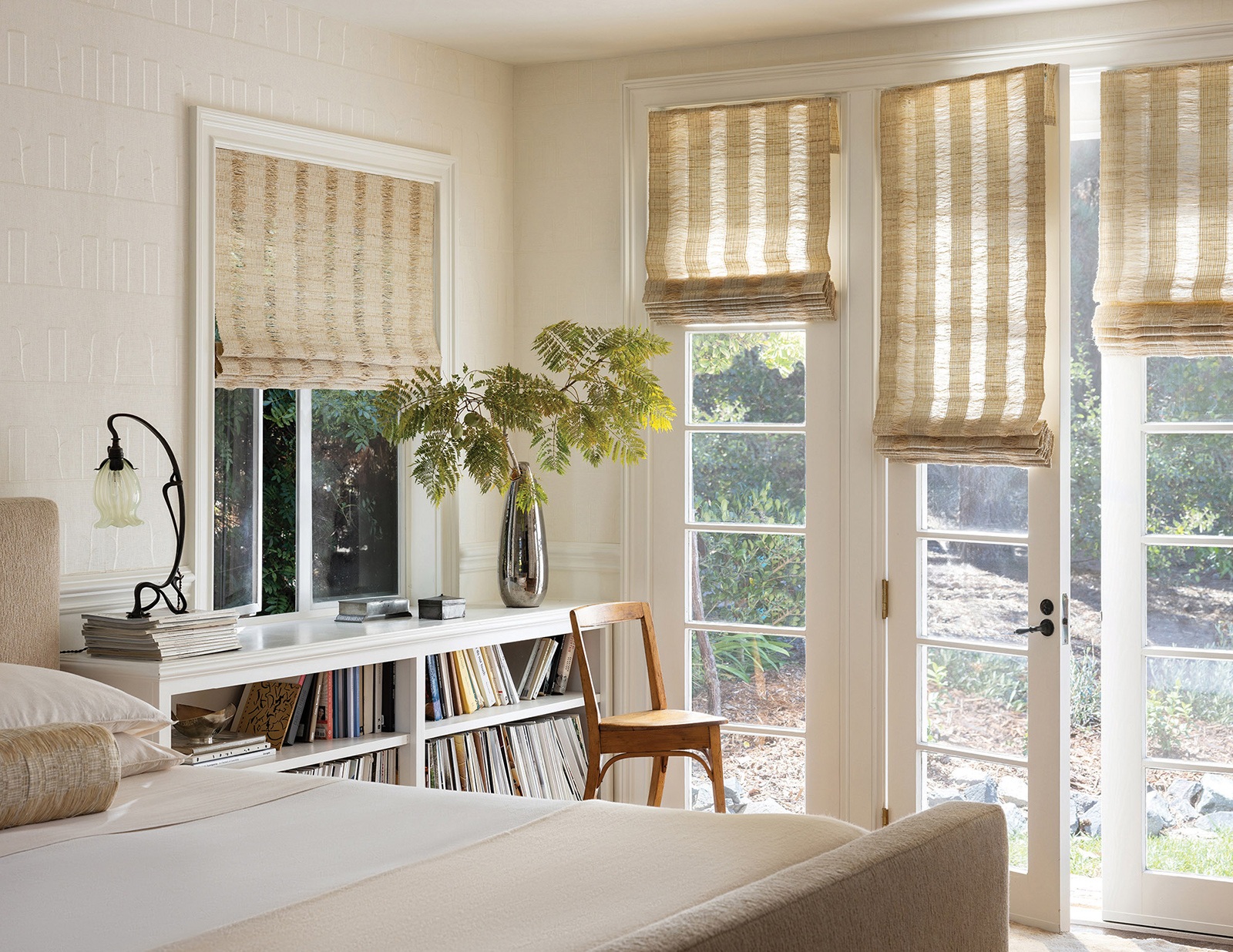
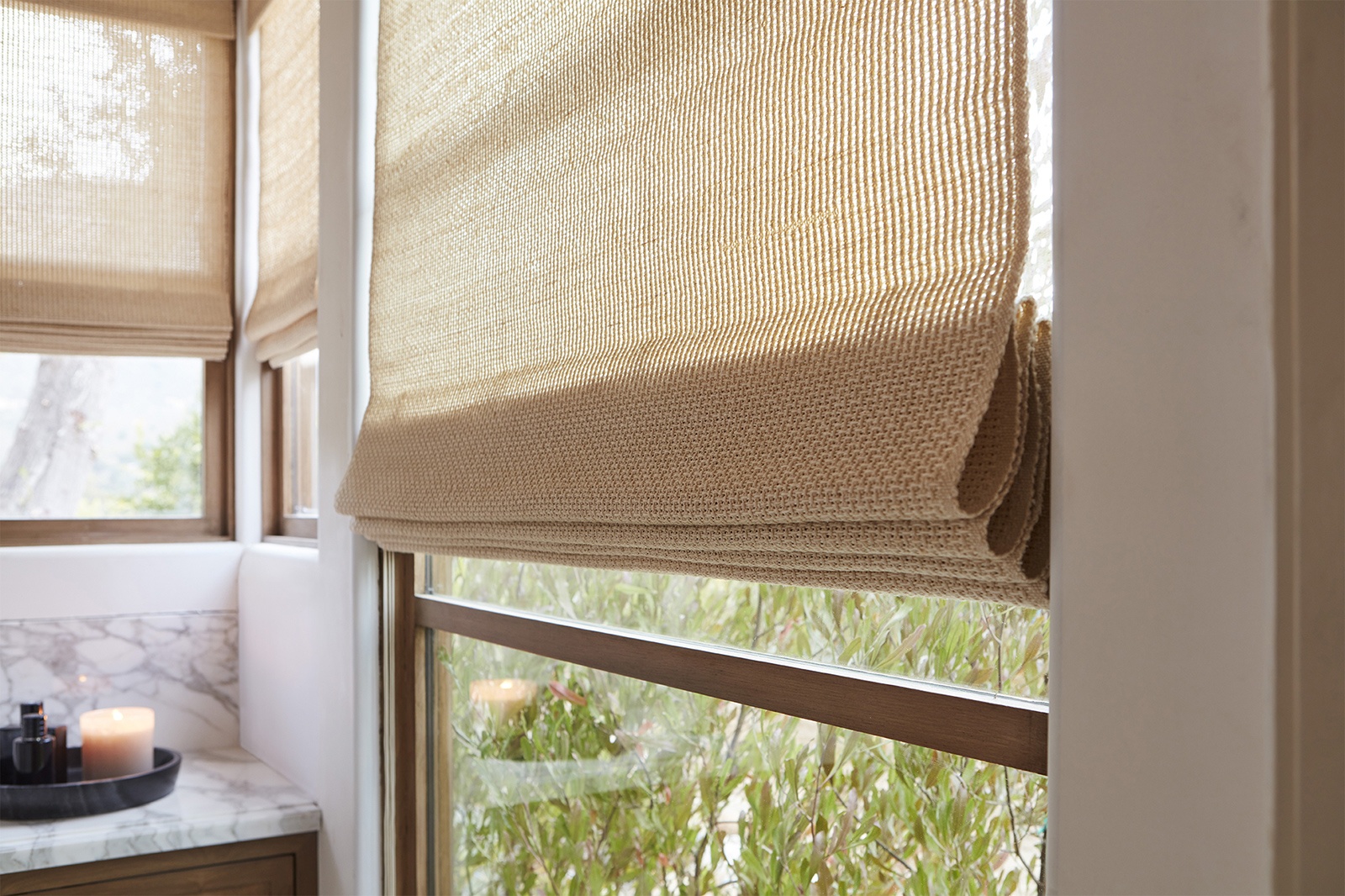
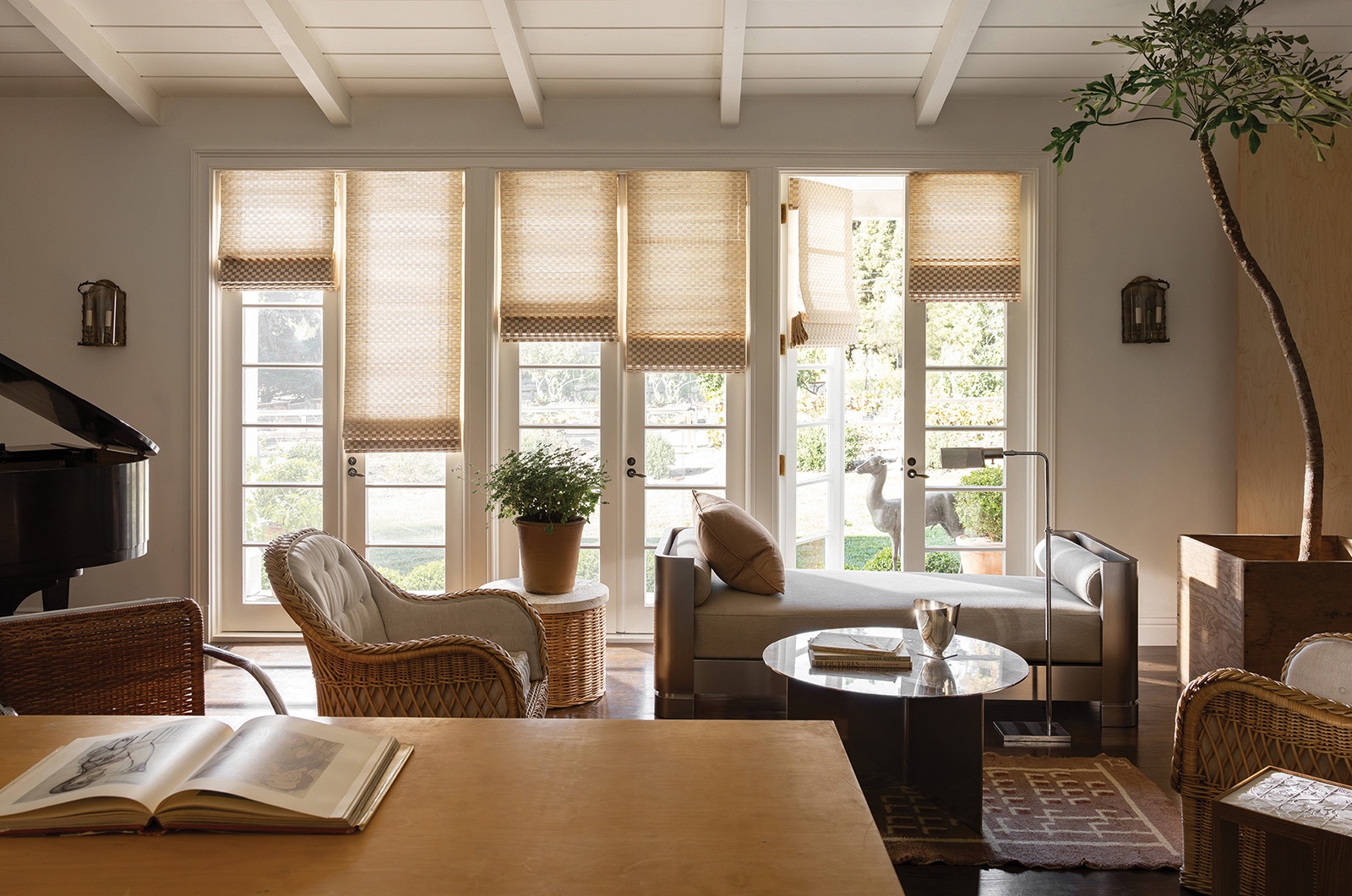
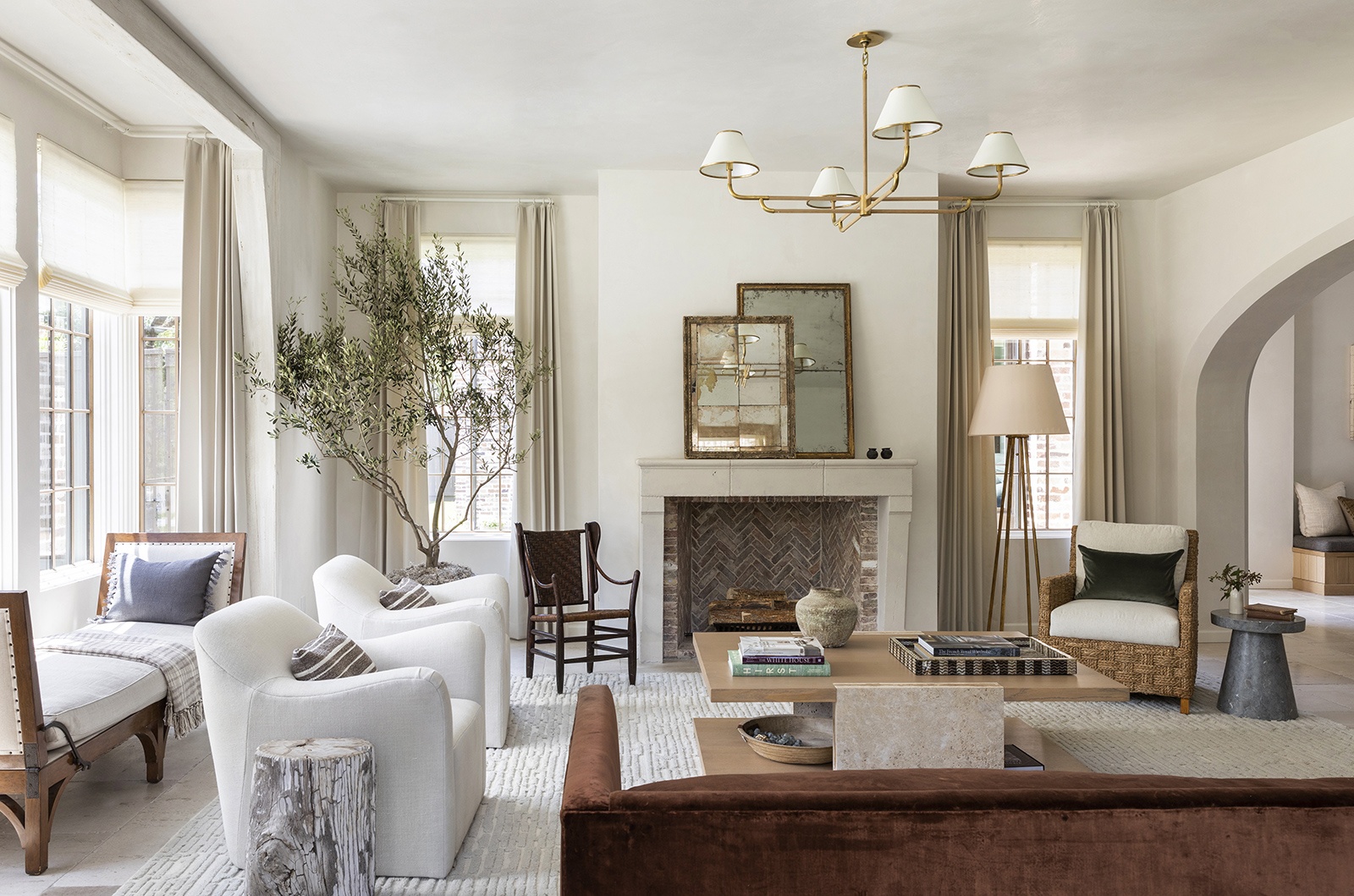
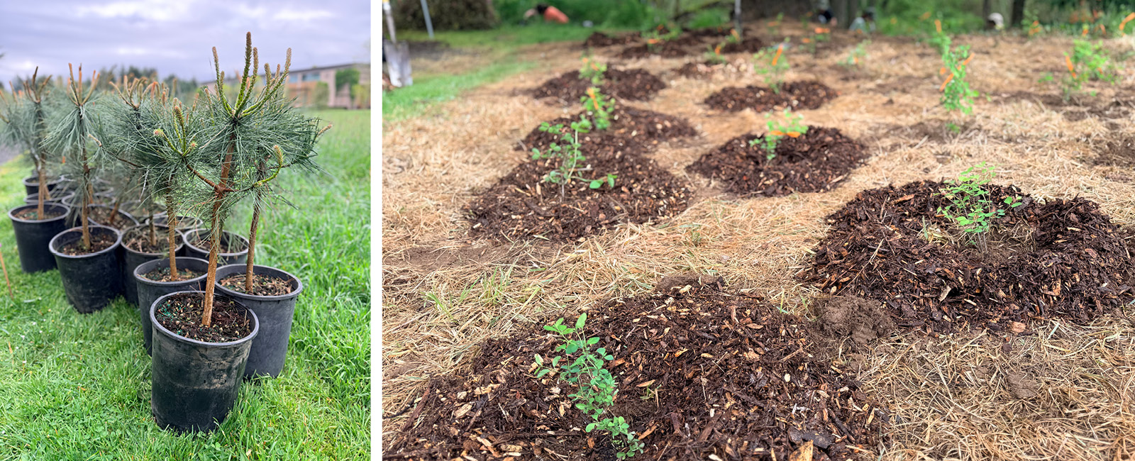
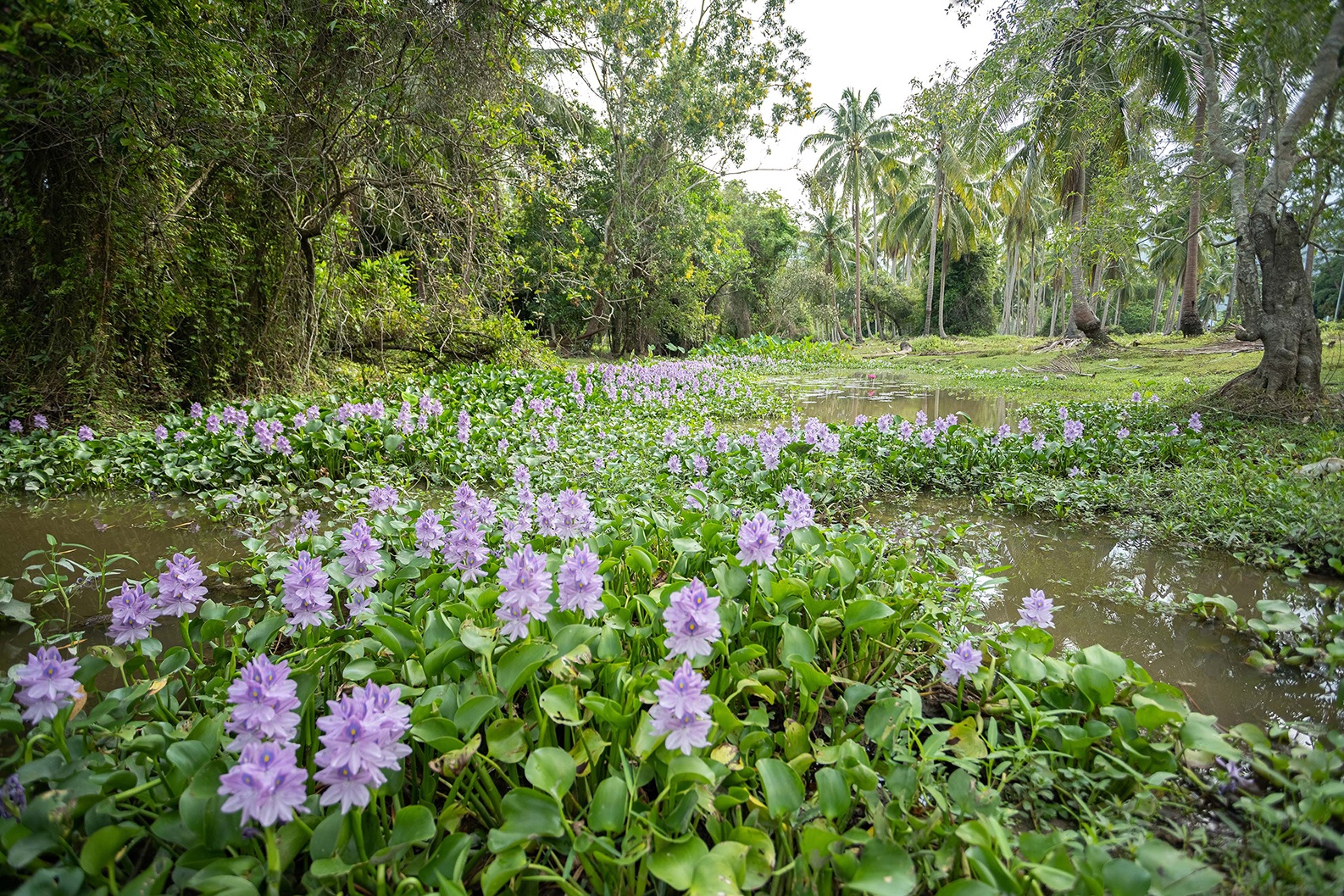
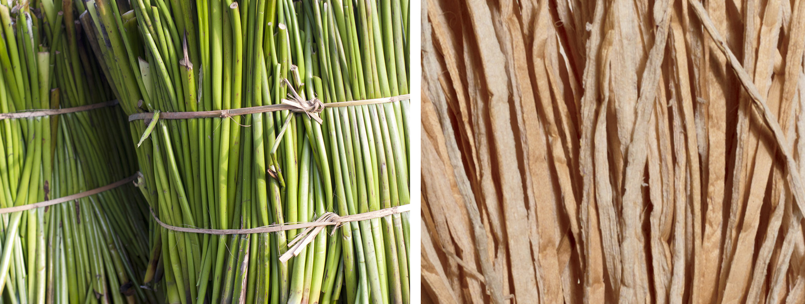
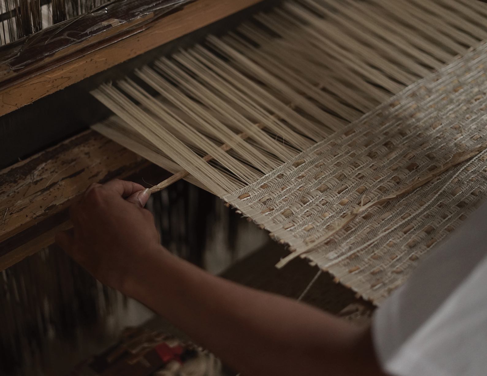
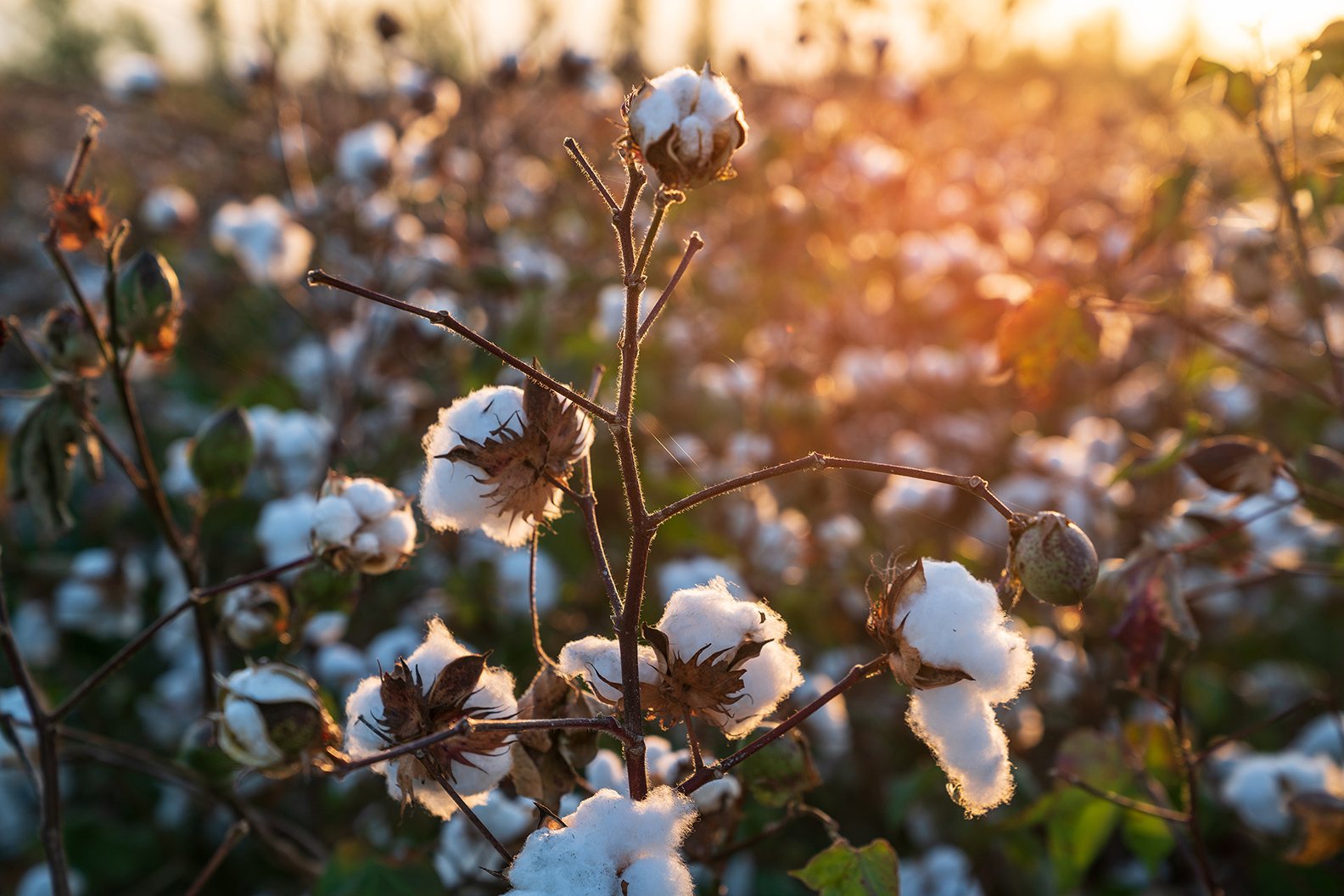
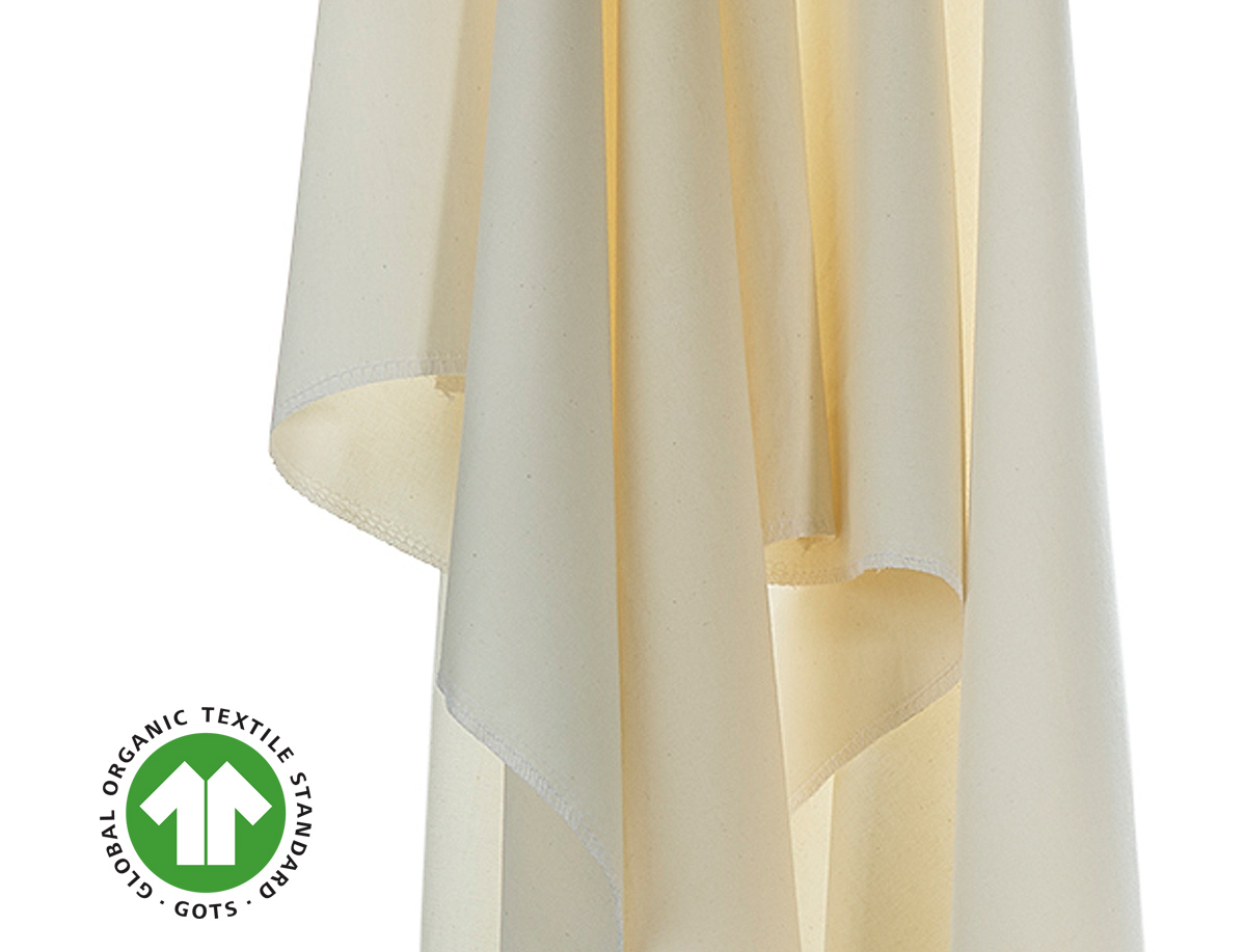
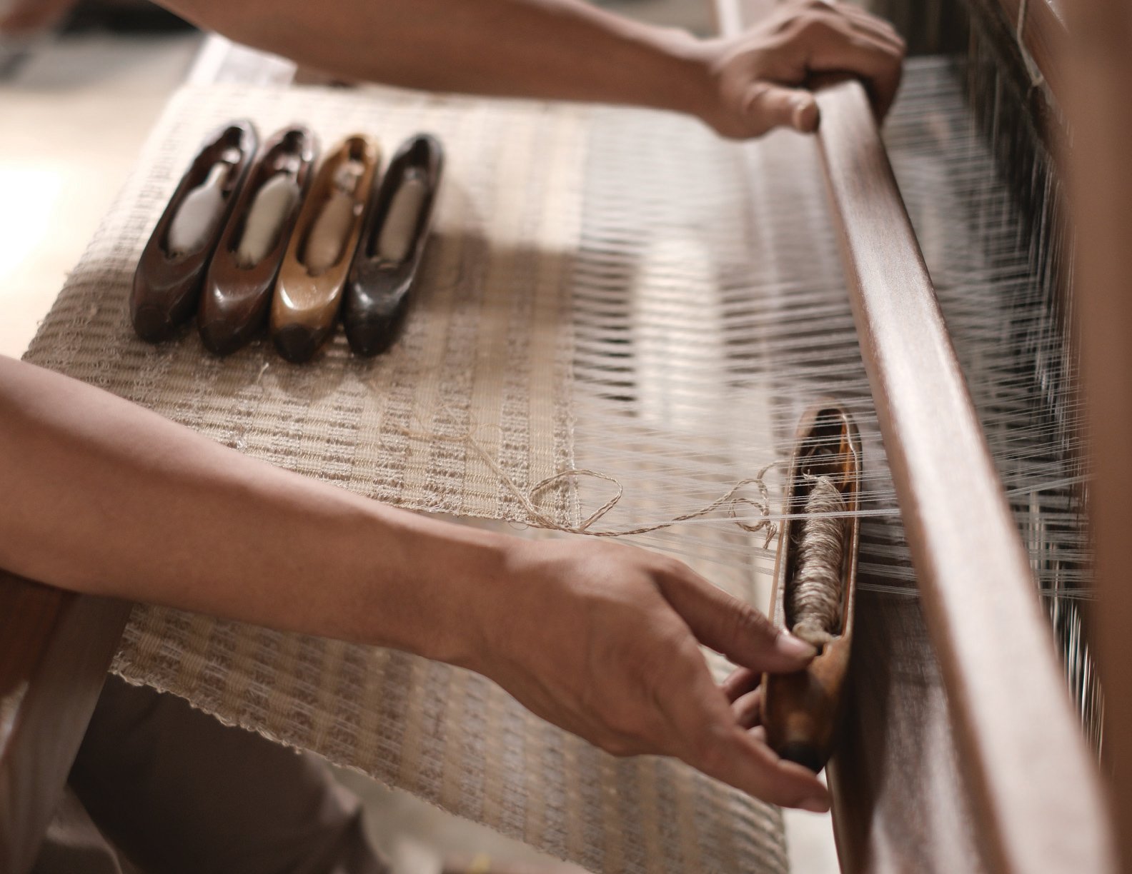
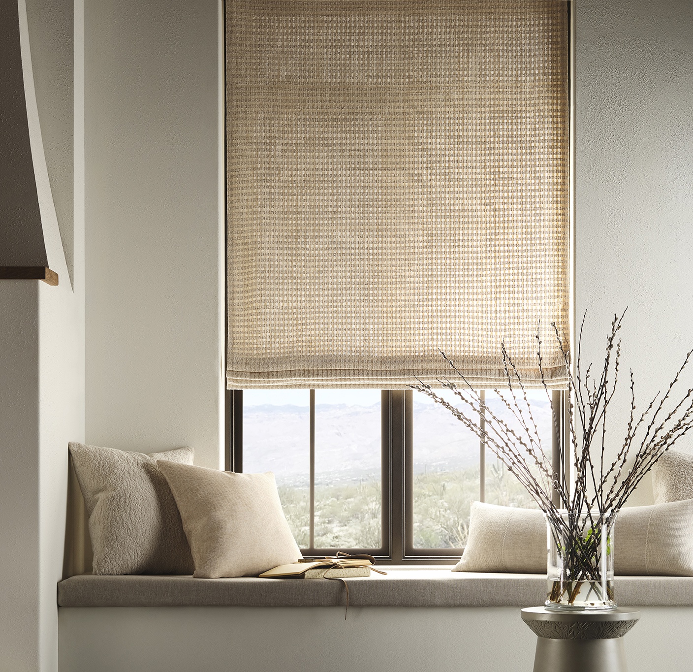
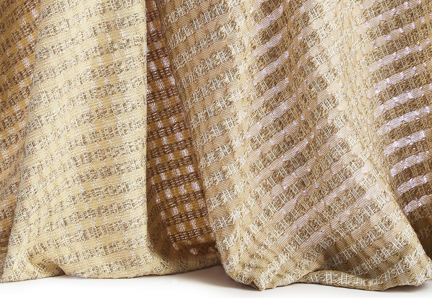
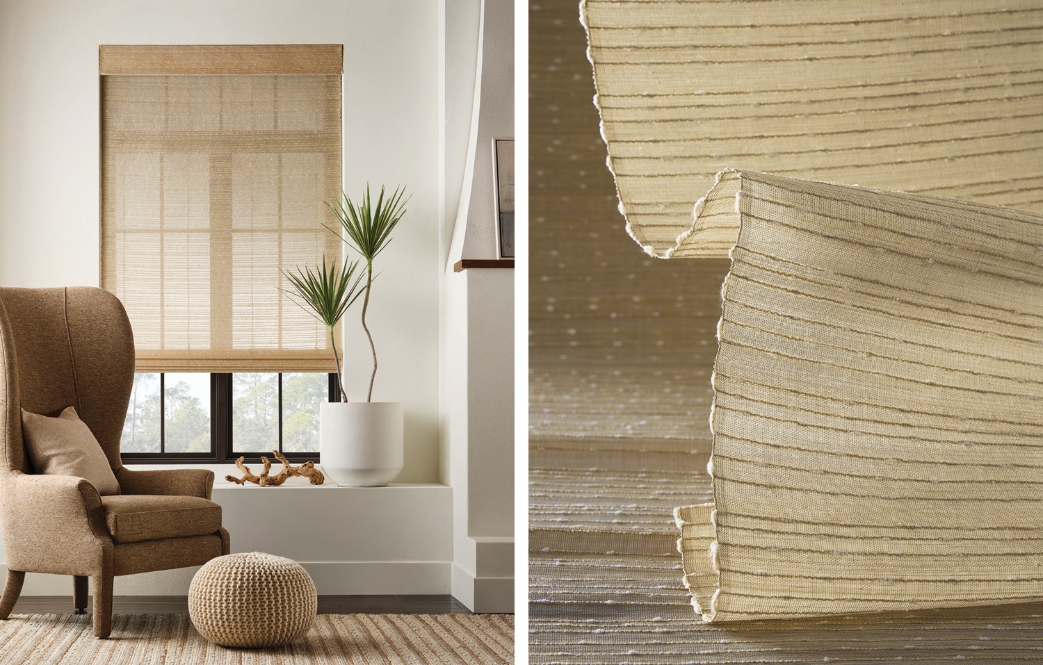
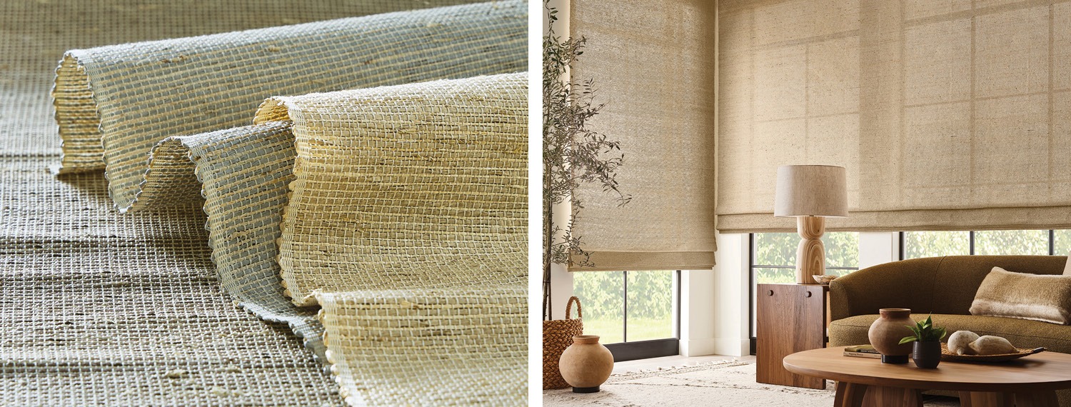
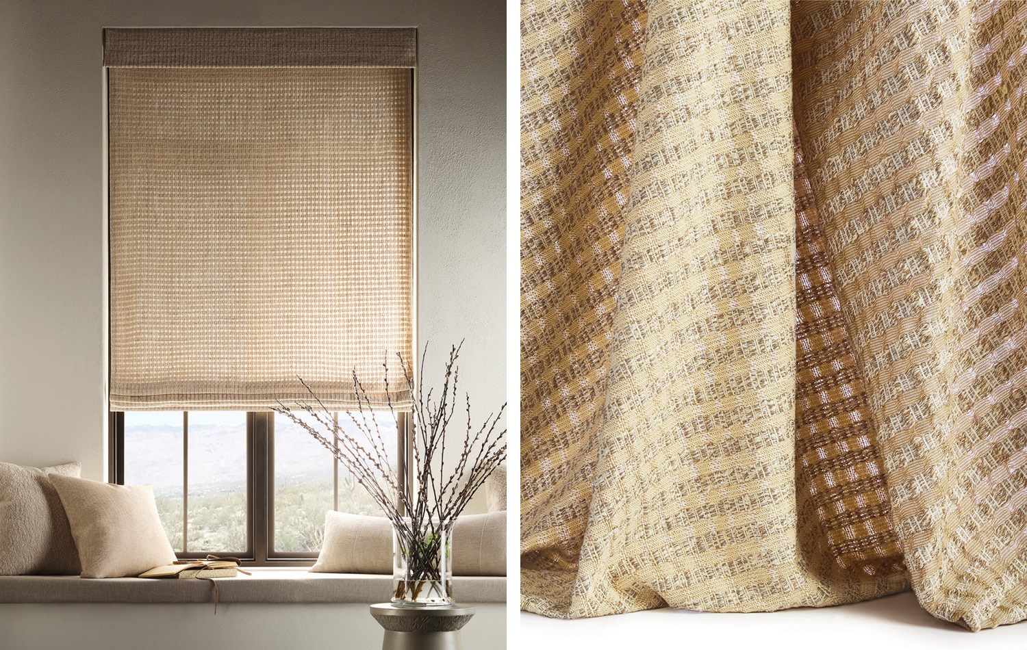
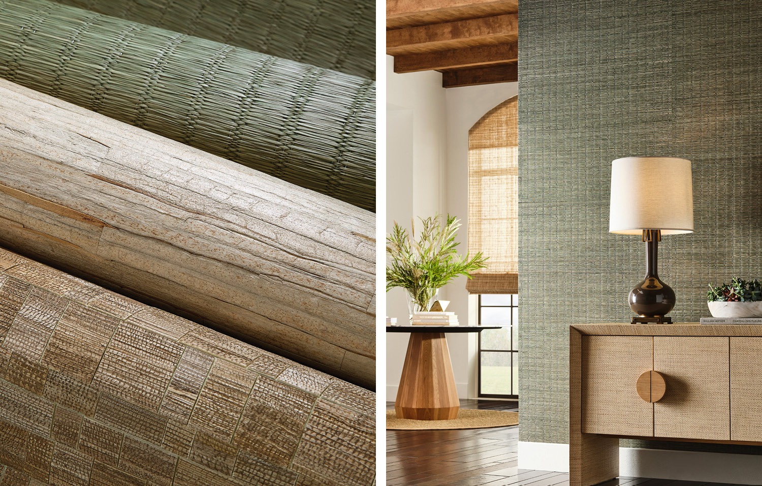
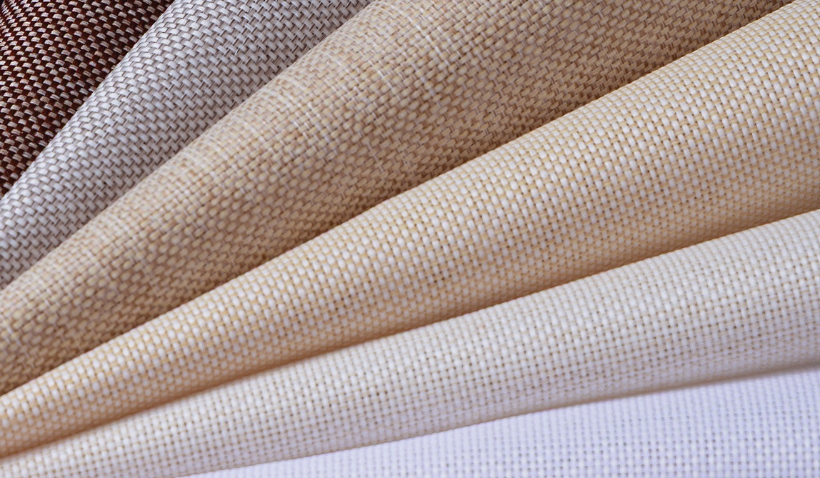
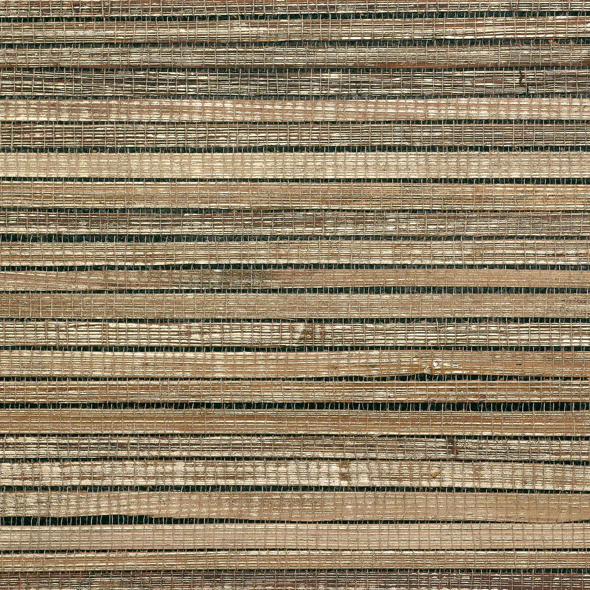
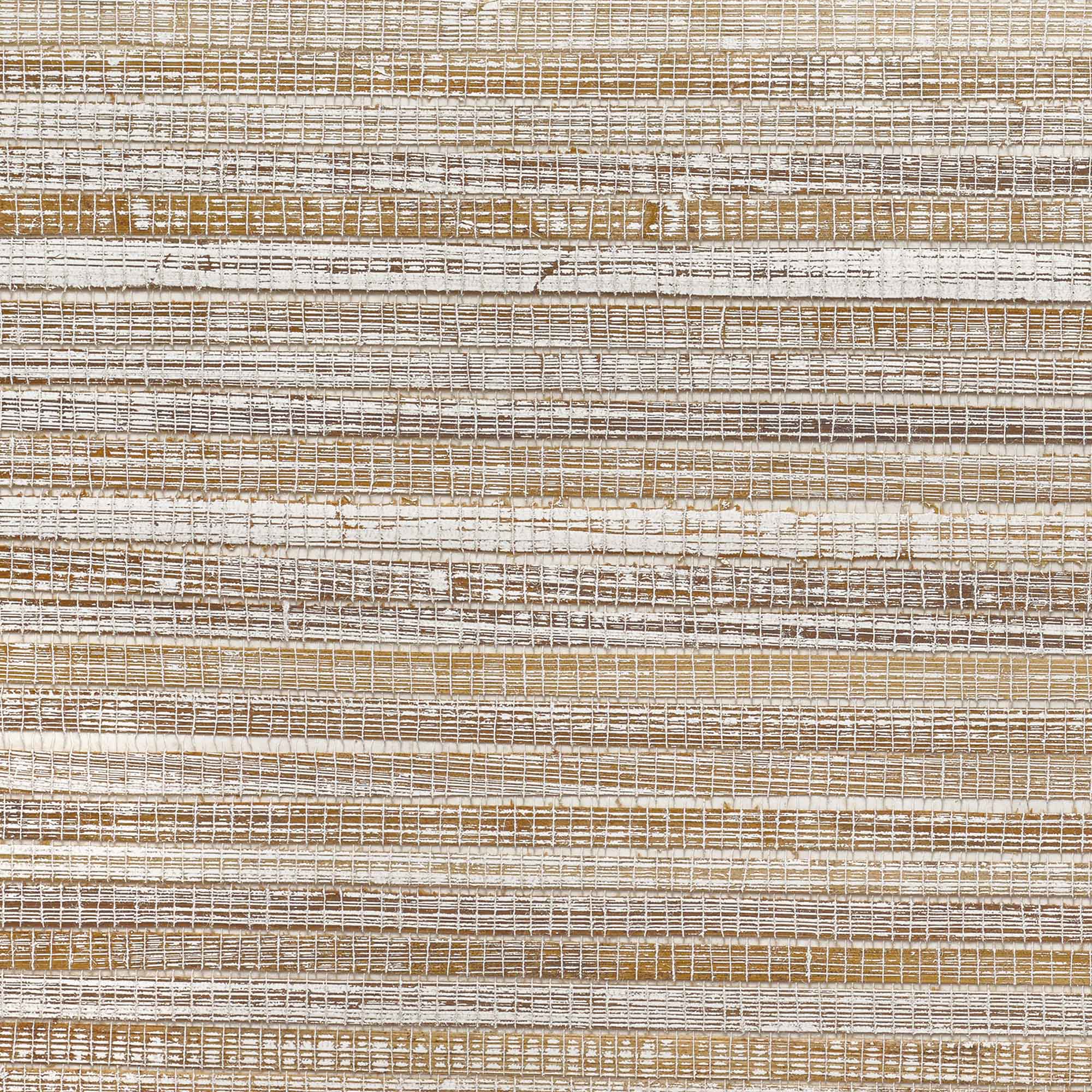
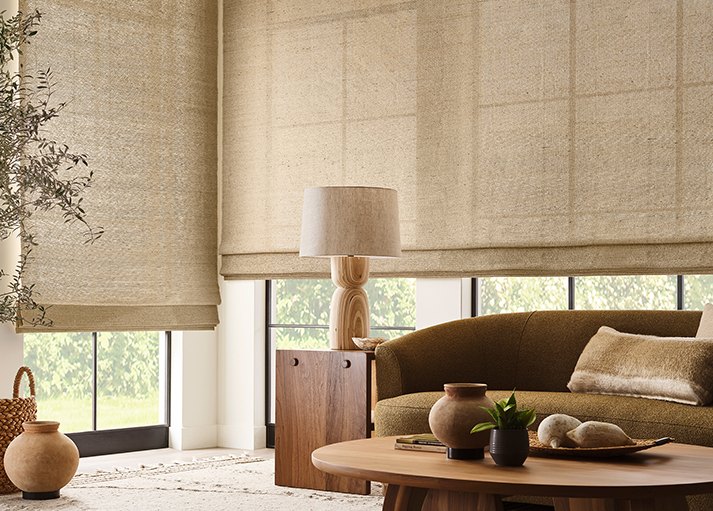
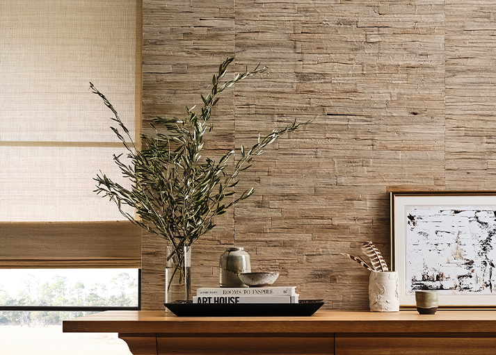
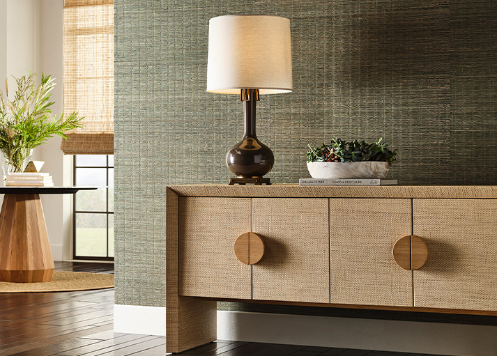
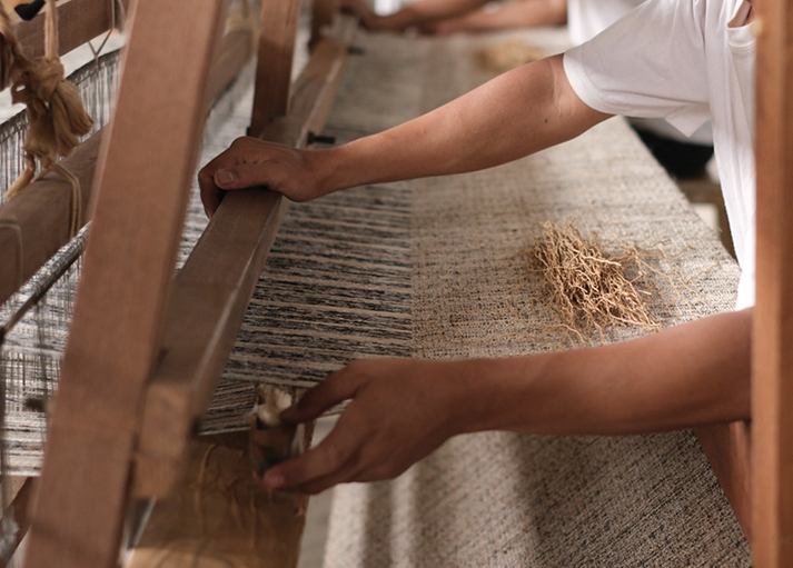
Sustainability is not a program or initiative. It is a philosophy woven into every aspect of our business. From responsibly sourcing natural materials and supporting artisan craftsmanship to reducing environmental impact throughout our operations, we continually seek opportunities to create with greater intention and care.
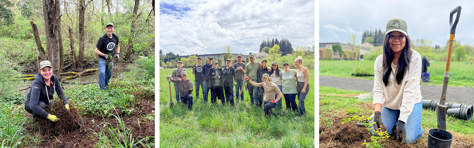
This commitment extends beyond the products we offer. It informs how we collaborate with our partners, support our employees, engage with our community, and invest in the future of our industry. We believe thoughtful design and responsible business practices should work hand in hand, creating beautiful interiors while honoring the natural resources that make them possible.
Being recognized among Oregon's most environmentally responsible organizations for fourteen consecutive years is a meaningful reminder that sustainability is not defined by a single accomplishment. It is built through consistent actions, long-term thinking, and an ongoing dedication to improvement.
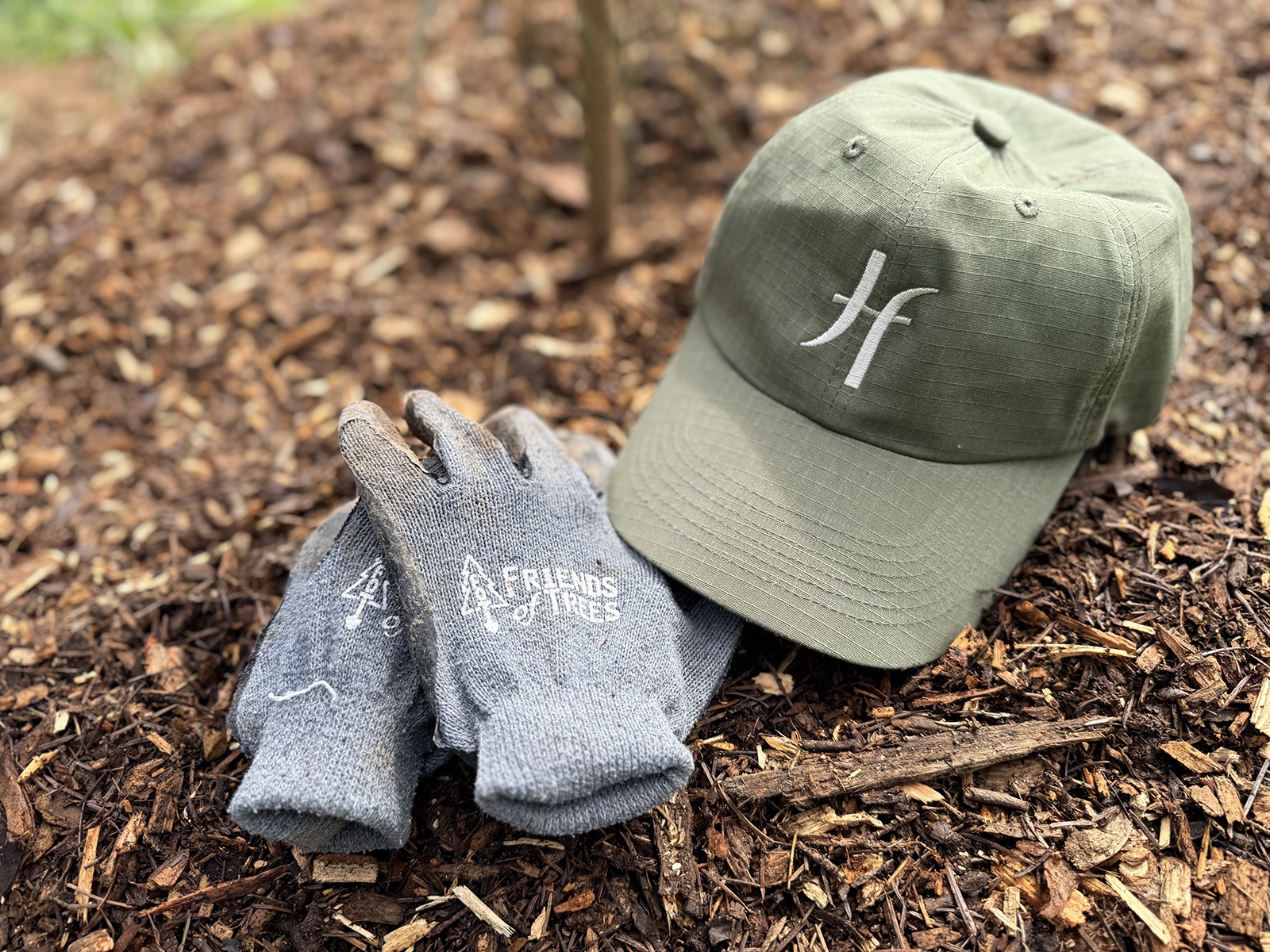
We are grateful to our employees, clients, suppliers, and partners who share in this commitment and help make this recognition possible. Together, we remain focused on creating products and experiences that reflect our values while contributing to a healthier, more sustainable future.
As we celebrate this milestone, we remain inspired by the work still ahead and committed to advancing our stewardship efforts for years to come.